Background
itison is a deals and events company, where you purchase vouchers online, then redeem them by bringing a print out or a copy of your voucher code. The hosts would redeem these vouchers using the customers Voucher Code on itison’s redemption site, HUB.
Understanding the problem
I took over this project in July 2019, research and user journey’s had already been mapped out. Being a fresh pair of eyes, I further developed ideas and mocked up a basic user journey.
-
Customers were having to print vouchers or show vouchers off their phone
-
Hosts were having to collect print-outs or have a jotted down note of the voucher code
-
Hosts were also having to take time out of their working day to redeem the vouchers on HUB to be paid
Project vision and solutions
We needed a fast and reliable process that would not cause inconvenience for the customers or the hosts.
-
We want a generally quick process - staff are busy and taking a large amount of time to redeem a voucher is ineffective
-
We want to make it clear that customers can not redeem their own vouchers
-
A smooth and pleasant user journey, with clear and concise messages
After a lot of discussions and mapping out journeys, a final process was created.
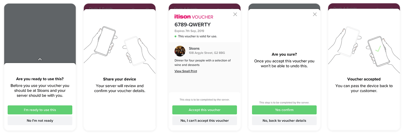
Customer arrives at restaurant - User finds voucher and uses Paperless Voucher - Message to indicate what needs to happen before continuing - Pass phone to server - Server checks voucher details - Accepts voucher - Second confirmation screen for server - Pass phone back to customer - End
For the design, I wanted to create a very clean aesthetic within a modal. The modal would help streamline the new process, and the server wouldn’t simply ask for the voucher code.
Problems that were raised from 1st prototype
One of the major problems we wanted to avoid was having accidental redemptions from customers messing about with the app. I felt this message wasn’t strong enough in my first prototype. I wanted to create clearer messages within the designs to show who should be handling the device at a time. I also felt the designs were slightly lacking in an enjoyable process. Adding animations to the passing device screens could help further improve the process and add a bit of character.
Working Prototype

User testing
I created a clickable Invision prototype so that we could test out the project. We demoed the Paperless vouchers for a team at a Glasgow restaurant. Response to the process was all broadly positive, and we were able to tweak the copy to help solve problems that had arisen. Further testing took place with more Glasgow hosts, and we built up an ideal ‘host’ that we could suitably launch Paperless Vouchers with.
And then the pandemic happened...
We were set to launch end of March 2020 in a few Glasgow restaurants and bars. Staff testing had happened and all problems were ironed out. I had started developing a brand we could use on the site and social to promote the process. Then COVID-19 happened, and I basically had to start back and rethink the user journey over again. It was no longer an intuitive idea to be passing your mobile device between you and a server. A slightly updated process was introduced, while still retaining the importance about who was to do what.
Updated prototype

Branding
I wanted the branding for Paperless Vouchers to look sleek and friendly in the same way the animations convey this. I wanted the logo to be more abstract than literal. The logo would also be used across the site to show if this feature was available across different deals so had to differ from what is typically on the site.
Colours


Icons for site
Logo
Onboarding
As well as creating various adverts across the site and on vouchers, I created an Onboarding journey to help users understand the new process. I had the chance of exploring After Effects more and created some more animations to improve the onboard.